Log in
If you're a student, please log in, so you can get the most from this page.
Lesson contents
What is a navbar?
A navbar is a menu-looking thing, like this:
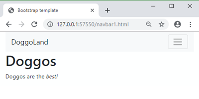
In BS, the navbar can include branding, to make an entire header.
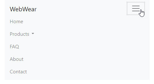
If you view the menu on a phone, the browser will collapse the menu under a hamburger icon:

BS magic at work.
Simple navbar
Let's start with something simple for now. We'll make this:
First, we need a place for the navbar to live on the page. Let's give the navbar its own row in the layout.
- <!-- Navbar -->
- <div class="row">
- <div class="col">
- ...
- </div>
- </div>
- <!-- Content -->
- <div class="row">
- <div class="col">
- ...
- </div>
- </div>
Now let's copy the navbar sample from the BS website, and remove everything we don't need for this example.
There's a lot of code! Don't worry about it. You don't need to sweat the deets. Not much, anyway. I'll show you what parts you need to think about.
We end up with:
- <nav class="navbar navbar-expand-lg navbar-light bg-light">
- <a class="navbar-brand" href="#">Navbar</a>
- <button class="navbar-toggler" type="button" data-toggle="collapse" data-target="#navbarSupportedContent" aria-controls="navbarSupportedContent" aria-expanded="false" aria-label="Toggle navigation">
- <span class="navbar-toggler-icon"></span>
- </button>
- <div class="collapse navbar-collapse" id="navbarSupportedContent">
- <ul class="navbar-nav mr-auto">
- <li class="nav-item active">
- <a class="nav-link" href="URL HERE">Home <span class="sr-only">(current)</span> </a>
- </li>
- <li class="nav-item">
- <a class="nav-link" href="URL HERE">Link</a>
- </li>
- </ul>
- </div>
- </nav>
Here's what it looks like.
There's a tag we haven't seen before, nav, and properties we haven't seen before, like data-toggle. That's OK. They just work.
So what do you need to change?
Changing an id
First, notice that id of navbarSupportedContent. It's there three times. The code will work only if they all match. If you change navbarSupportedContent to doggoDrool, you need to change it in the other places to match.

Georgina
Would we need to change it at all? Can we just leave it at navbarSupportedContent?
You only need to change the id if you have more than one navbar on the page. If you don't, you shouldn't need to change it.
The active link
The other thing is the code for the Home link. Compare it to the link below it. Here they are again:
- <li class="nav-item active">
- <a class="nav-link" href="URL HERE">Home <span class="sr-only">(current)</span> </a>
- </li>
- <li class="nav-item">
- <a class="nav-link" href="URL HERE">Link</a>
- </li>
The highlighted code marks the Home link as active, by giving it the class of active. It shows users what page they're on.
- If they're looking at the home page, the Home link should have the
activeclass. - If they're on the blog page, the Blog link should have the
activeclass. - If they're on the FAQ page, the FAQ link should have the
activeclass.
The active class adds some special styling, to make the link look a little different.
There are two links in the code we saw. For users looking at the second page, the link for that page would be active.
- <li class="nav-item">
- <a class="nav-link" href="URL HERE">Home</a>
- </li>
- <li class="nav-item active">
- <a class="nav-link" href="URL HERE">Link <span class="sr-only">(current)</span></a>
- </li>
Besides the active class, there's a span, with the class sr-only, It's an a11y thing.
What does the sr in the class sr-only stand for?

Adela
You said it's an a11y thing, so is sr short for screen reader?
Yep, you got it. Here's the link again.
- <a class="nav-link" href="#">Link <span class="sr-only">(current)</span></a>
The content "(current)" will be hidden, except to screen readers. They'll read out the word to blind users. Also, screen reader software can look for the sr-only class to help users know there they are.
OK, that active link stuff? BS won't put the active and sr-only classes in the HTML for you. Getting it to work right (with the navbar reuse stuff you'll learn later) requires programming, which you don't know how to do.
If you're working with a programmer, or you're a programmer yourself, you can have a program that will add active and sr-only. But for this class, I don't expect you to do that.
So, you can just remove the active link stuff:
- <li class="nav-item">
- <a class="nav-link" href="#">Home</a>
- </li>
- <li class="nav-item">
- <a class="nav-link" href="#">Link</a>
- </li>
Not ideal, but we can live with it.
Here's what the navbar looks like with the active link marked.
Here's the same thing, without the active link. Both Home and Link look the same.
Here's the code for the second one, with places for the URLs:
- <nav class="navbar navbar-expand-lg navbar-light bg-light">
- <a class="navbar-brand" href="index.html">Navbar</a>
- <button class="navbar-toggler" type="button" data-toggle="collapse" data-target="#simpleNavbar"
- aria-controls="simpleNavbar" aria-expanded="false" aria-label="Toggle navigation">
- <span class="navbar-toggler-icon"></span>
- </button>
- <div class="collapse navbar-collapse" id="simpleNavbar">
- <ul class="navbar-nav mr-auto">
- <li class="nav-item">
- <a class="nav-link" href="YOUR URL HERE">Home</a>
- </li>
- <li class="nav-item">
- <a class="nav-link" href="YOUR URL HERE">Link</a>
- </li>
- </ul>
- </div>
- </nav>
You can copy-and-paste this to make your own navbars, if you like.
Adding links
You can add as many links as you like to the menu.
- <li class="nav-item">
- <a class="nav-link" href="puppers.html">Puppers</a>
- </li>
- <li class="nav-item">
- <a class="nav-link" href="doggos.html">Doggos</a>
- </li>
- <li class="nav-item">
- <a class="nav-link" href="llamas.html">Llamas</a>
- </li>
Too many links gets confusing for users. Try to keep to a maximum of around seven.
Changing the look and feel
There are some options you can use to change how the navbar looks. For example, you can change the menu's color from light to dark. This is from the official navbar page:
- <nav class="navbar navbar-dark bg-dark">
- <!-- Navbar content -->
- </nav>
You can set your own background color with a mix-in:
- <nav class="navbar navbar-light navbar-custom">
- <!-- Navbar content -->
- </nav>
Your CSS might have this rule:
- .navbar-custom {
- background-color: #e3f2fd;
- }
Another fun thing you can do is make the navbar stick to the top of the page, as in this example.
fixed-top is the class you want.
- <nav class="navbar fixed-top navbar-light bg-light">
- ...
- </nav>
There's much more you can do. Check out the official navbar docs.
Nested menu items
You can add a drop down menu, like the Rides in this navbar:
How do you make it? Here's code for a regular menu item, from before:
- <li class="nav-item">
- <a class="nav-link" href="llamas.html">Llamas</a>
- </li>
Replace it with code that includes a dropdown.
- <li class="nav-item dropdown">
- <a class="nav-link dropdown-toggle" title="Get your thrill on!" id="navbarDropdown" role="button" data-toggle="dropdown" aria-haspopup="true" aria-expanded="false" href="#">
- Rides
- </a>
- <div class="dropdown-menu" aria-labelledby="navbarDropdown">
- <a class="dropdown-item" href="URL HERE" title="Spinning fun!" >Doggotron</a>
- <a class="dropdown-item" href="URL HERE" title="I'll be bark" >Doggolator</a>
- <a class="dropdown-item" href="URL HERE" title="A bazillion happy doggos">Dogarium</a>
- </div>
- </li>
See the id of navbarDropdown? You have to make sure that only one item on the page has that id. You might have multiple dropdowns, so use different ids for each one.
Responsive breakpoints
When the browser window gets small, navbars collapse vertically, under a hamburger icon:

That's good, but you need to think about how small the window should get before the navbar collapses.
These videos show the issue. When the navbar breakpoint is too narrow:
When the navbar breakpoint is too wide:
When the navbar breakpoint is just right:
The differences between these navbars is just one class, added to the nav tag. This is the version that's too narrow:
- <nav class="navbar navbar-expand-lg navbar-light bg-light navbar-expand-sm">
The navbar is in its regular horizontal view for small windows and up. But the menu is too wide for small windows, so it gets jumbled.
This is the version that's too wide:
- <nav class="navbar navbar-expand-lg navbar-light bg-light navbar-expand-lg">
The navbar is in its regular horizontal view for large windows and up. For medium-sized windows, the menu is in its vertical form. But medium windows can fit the horizontal form quite easily.
This is the version that's just right:
- <nav class="navbar navbar-expand-lg navbar-light bg-light navbar-expand-md">
The menu is in vertical hamburger form for extra small and small windows. For medium windows and up, the menu is in its regular horizontal form. That gives the best user experience.

Adela
So we should always use navbar-expand-md?
No, it depends on your menu's width. You need to experiment. Try different classes, and see which one works best for your site. Here are the classes you can use:
navbar-expand: Never collapses vertically, stays horizontal (only use for very small menus)navbar-expand-sm: Collapses belowsmwidths, < 576pxnavbar-expand-md: Collapses belowmdwidths, < 768pxnavbar-expand-lg: Collapses belowlgwidths, < 992pxnavbar-expand-xl: Collapses belowxlwidths, < 1200px
Most of the time, you'll use either navbar-expand-sm or navbar-expand-md, depending on the width of your menu.
Accessibility
BS's navbar templates give you all the a11y you need. For example, here's one element:
- <button class="navbar-toggler" type="button" data-toggle="collapse" data-target="#dropDownMenu" aria-controls="dropDownMenu" aria-expanded="false" aria-label="Toggle navigation">
See the aria-controls and aria-expanded properties? They work with screen readers and other a11y software. They're already included in the templates.
Part of a11y is that the navbar should be usable with just the keyboard. You can try it out on this page. Click in your browser's address bar. Now press Tab, and the browser will select a link each time you do. The selected link is said to have the focus. The focus will march across the navbar.
When the top entry in a dropdown has the focus, press the down arrow. The menu expands.
Cool!
Exercise
Next up
Let's see how you can make one navbar, and reuse it across your entire site. A big productivity win.


