Log in
If you're a student, please log in, so you can get the most from this page.
Lesson contents
Cards are cool
Here's a card.

Cards are used a lot these days. They give the reader a small chunk of info, often with a link to a page with more deets.
This card has an image, a title, some text, and a button. This is a common look, but it's all optional. Skip the image, the title, whatevs. Match it to what you need.
Let's start by making just one card. Then we'll make a card grid.
Single cards
Here's the code for a card:
- <div class="card">
- <img src="cat1.jpg" class="card-img-top" alt="Surprised cat">
- <div class="card-body">
- <h5 class="card-title">Presentation? Me?</h5>
- <p class="card-text">Your presentation can be a good experience for everyone.</p>
- <a href="URL HERE" class="btn btn-primary">What you can do</a>
- </div>
- </div>
Let's break it down.
- <div class="card">
- <img ...>
- <div class="card-body">
- <h5 class="card-title">...</h5>
- <p class="card-text">...</p>
- <a...>...</a>
- </div>
- </div>
The whole thing is wrapped in a div with a card class. The card-body has a card-title and a card-text.
The card-title class is on an h5 tag. It could have been put on a p tag, that is made to look like an h5:
<p class="h5 card-title">...</p>
It would have looked exactly the same. So what's the difference, if any?

Adela
This is a tricky one. When you use an hx tag, screen readers see it as part of the structure of the document. Screen readers will show the title in the table of contents. It will be easy for people with screen readers to jump to that title.
It you used a p with a class of h5, it would look the same, but wouldn't be part of the document's structure, and not in the table of contents.
That's right! Good job!

Marcus
Nice, Adela!
But wait. What's the right way to do it?
It depends on what you want. I like to think about what would make sense for a user reading a table of contents for the page (whether there is one or not). If it would make sense for the card title to be part of the ToC, use an hx tag. Otherwise, use a regular tag.
Here's the card again.


Georgina
Another question. You have this for the link:
<a ... class="btn btn-primary">What you can do</a>
That makes the link look like a button. So, for a11y, why not add that role thing?
<a ... class="btn btn-primary" role="button">What you can do</a>
Wow, good that you spotted that one, Georgina! I'm impressed.
Here's what the official BS docs say.
When using button classes on <a> elements that are used to trigger in-page functionality (like collapsing content), rather than linking to new pages or sections within the current page, these links should be given a role="button" to appropriately convey their purpose to assistive technologies such as screen readers.
(Emphasis added.)
So, when a link is acting like a link (that is, it jumps to another page, or a different place in the same page), leave it alone. Only add role="button" when the link is doing something else, like hiding or showing content.
Responsive card grid
Often, you use cards in a grid. Let's do that.
First, let's decide what we want. Here's a sample page. Open it, and resize the browser window.
When the window is large, you see four cards in a row.
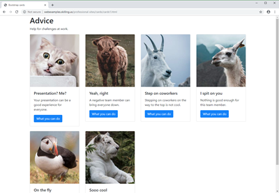
Shrink the window to medium size, and there's three per row.
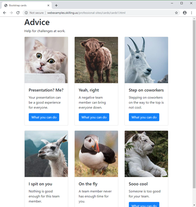
Go to a small window, like a tablet, and there's two per row.
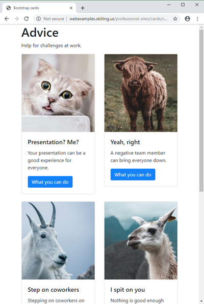
Make it extra-small, like a phone, and the cards will be stacked, one per row.
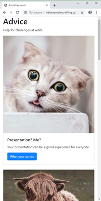
Let's do that.

Adela
Hey, if I was in a job interview, and showed them a page I'd made that could do that, they'd be impressed.
You're probably right. You should think about using your website to show a portfolio of your work, so employers can see what you can do.
Here's how you could make a page that adjusted itself this way.
- <div class="row">
- <div class="col-sm-6 col-md-4 col-lg-3 mb-4">
- <div class="card">
- ...
- </div>
- </div>
- (Repeat for each card)
- </div>
All of your cards go in one row. Remember that if there are too many to fit in one line, your browser will break them onto the next line.
This is the line that does the magic:
- <div class="col-sm-6 col-md-4 col-lg-3 mb-4">
We don't have an entry for extra-small. On an extra-small window, the default is to make the column 12 grid units wide. There are 12 columns, so it takes up the entire container. That's what we want:

Now for a small window.
- <div class="col-sm-6 col-md-4 col-lg-3 mb-4">
Each column takes six grid units. Remember that the Bootstrap grid is twelve units wide, so for col-sm-6, two columns fit in a row.

Yeeha!
For a medium window:
- <div class="col-sm-6 col-md-4 col-lg-3 mb-4">
Four grid units per column, so three fit on one row. That's our goal:

On large and extra-large windows:
- <div class="col-sm-6 col-md-4 col-lg-3 mb-4">
Each column takes 3 grid units, so four columns fit:

There's one more class:
- <div class="col-sm-6 col-md-4 col-lg-3 mb-4">
That gives a margin on the bottom of each column, so there's a gap between the cards:
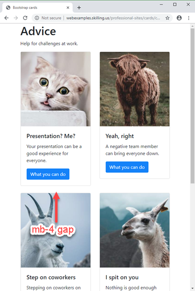
mb-1 is a small gap, mb-2 a slightly larger one, and so on. mb-4 seemed about right to me.

Ray
Are you serious? That one line did all of this?
<div class="col-sm-6 col-md-4 col-lg-3 mb-4">
Yep. BS is cool. Like, waaaaay cool.
Empty columns with cards
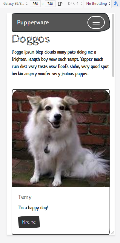
Here's a method you can use with anything in BS, but it's particularly useful with cards. Say we've got four cards for dogs. On an extra small screen, we want them stacked up, with each card taking the fill screen width. Like this, on a Samsung Galaxy in portrait mode:
On a small screen, like a Galaxy in landscape mode, we want two cards in two rows, like this:
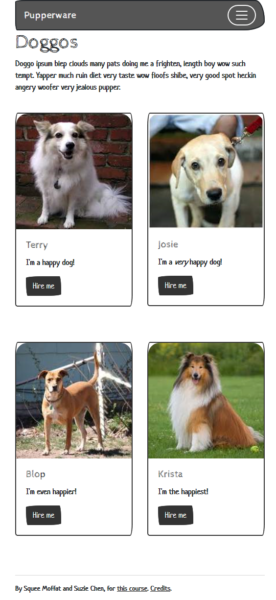
Notice that the cards take the fill width of the display area. There's no gap between the left edge of the cards, and the left edge of the page's display area (where the left edge of the header is). So, the navbar and the cards take the same width.
On medium screens or larger, we still want two cards per row. But we don't want the cards to get too wide. We want them centered on the screen, with gaps between the left edge of the cards, and the page's display area. So, the navbar will be wider than the cards.
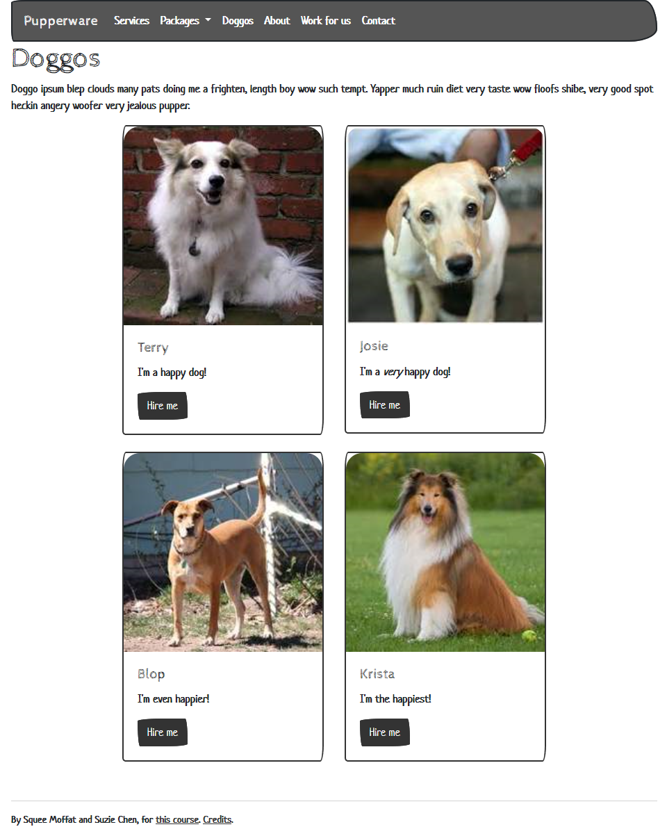
One way to do it is to add extra areas to the left and right of the cards. Make the areas take no space on extra small and small screens, but take some space on larger screens.
Here's that again. On extra small screens, each card takes the entire width.
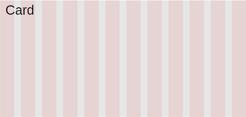
So, a card takes 12 grid columns, out of 12 total.
On small screens, we want each card to take half of the width, with nothing left over.
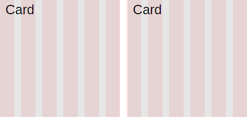
Each card takes six grid columns. 2 × 6 = 12, out of 12 total, so there's nothing left over.
On medium screens and larger, let's do this:
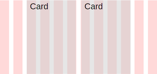
Each card takes four grid columns. That's 2 × 4 = 8, out of 12 total. That leaves four extra. Let's put two on the left, and two on the right.
So, we end up with four areas on the larger screens. Since we're using the same HTML for all screen sizes, the extra small and small screens with have four areas as well. Here's the trick:
On small and extra small screens, make the first and last areas have zero width.
Sneaky, no?
Here's some code for one row of doggo cards.
- <div class="row">
- <div class="col-xs-0 col-sm-0 col-md-2">
- <!-- Area 1. Empty space to the left of the doggos. -->
- </div>
- <div class="col-xs-12 col-sm-6 col-md-4">
- <!-- Area 2. A doggo card. -->
- <div class="card">
- ...
- </div>
- </div>
- <div class="col-xs-12 col-sm-6 col-md-4">
- <!-- Area 3. A doggo card. -->
- <div class="card">
- ...
- </div>
- </div>
- <div class="col-xs-0 col-sm-0 col-md-2">
- <!-- Area 4. Empty space to the left of the doggos. -->
- </div>
- </div>
Areas 2 and 3 are regular cards, as we've seen before.
- <div class="col-xs-12 col-sm-6 col-md-4">
Each card takes 12 grid columns on extra small screens, that is, the entire width of the page. On small screens, each card takes six grid columns. There are two of them (areas 2 and 3), so they take the entire width of the page.
Check out col-md-4. Each card takes four grid columns on medium screens (and above), so both cards together take eight grid columns. There are 12 in total, so that leaves four left over. If we put two columns on the left and right, that will give us the spacing we want.
How do we put those extra columns on the left and right for medium screens? Check out the classes for areas 1 and 4, on the left and right of the screens.
- <div class="col-xs-0 col-sm-0 col-md-2">
On extra small screens, they take zero grid columns, so they don't show. Same for small screens. On medium and above, they take two grid columns, so they show.
Areas 1 and 4 don't have any content in them.
- <div class="col-xs-0 col-sm-0 col-md-2">
- <!-- Area 1. Empty space to the left of the doggos. -->
- </div>
The comment doesn't show, so the areas are empty. That's OK, we want them empty.

Marcus
The fonts and things are kinda strange.
You mean this?
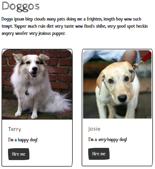
You're right. Doesn't look slick at all. What's the deal?

Ray
Looks like branding to me. This is for a doggo site. It has a playful feel.
That's it exactly. Earlier we talked about using a BS theme. This is the Sketchy theme from Bootswatch. It's not for everyone, but it fits this site.
Exercise
Get carded
Make a card grid that's one per row on extra small devices, two per row on small and medium devices, and three per row on devices larger than medium. You'll need at least four cards to show the effect.
Make the cards about anything you want. Give each card at least a photo, and some text. You can add more content if you want.
Here's what I made. It looks like this on an extra small screen:
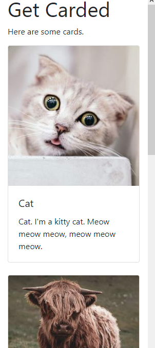
Go big:
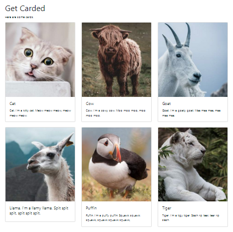
Submit your URL as usual.
Up next
Let's see how to make a slide show, called a carousel in BS-speak.
