Grids
The BS grid system is the key to making good layout. The grid divides the page container into 12 columns, with gutters.

We can use the grid to make a page layout. For example:
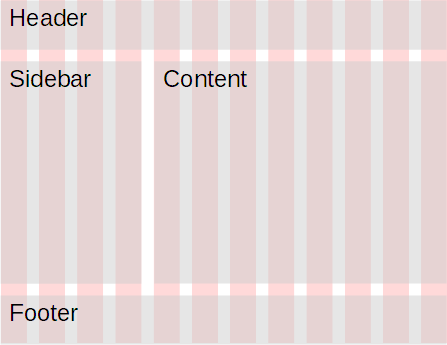
We make a grid with three rows.
- The first row uses all 12 columns to make a header region, that spans the width of the container.
- The second row uses four columns for the sidebar, and eight for the content region.
- The third row uses all 12 columns to make a footer region.
Class to set region width
We can use classes that BS provides to set the region width. Here's part of the template we've been using.
- <body>
- <div class="container">
- <div class="row">
- <div class="col">
- <h1>Doggos</h1>
- <p>Doggos are the <em>best!</em></p>
- </div>
- </div>
- </div>
- </body>
There's a container, inside that there's a row, and inside that there's a column.
Here's how we could make a layout like this:

The most important classes are marked.
- <body>
- <div class="container">
- <!-- Header -->
- <div class="row">
- <div class="col-12">
- <p class="h1">Doggo World</p>
- </div>
- </div>
- <div class="row">
- <!-- Sidebar -->
- <div class="col-4">
- <ul>
- <li>
- <a href="javascript:alert('Doggos rock!')">Home</a>
- </li>
- <li>
- <a href="javascript:alert('Doggos rock!')">Blog</a>
- </li>
- <li>
- <a href="javascript:alert('Doggos rock!')">Store</a>
- </li>
- </ul>
- </div>
- <!-- Content -->
- <div class="col-8">
- <h1>Are doggos the best?</h1>
- <p>Doggos are the <em>best!</em></p>
- </div>
- </div>
- <!-- Footer -->
- <div class="row">
- <div class="col-12">
- <p class="small">
- No rights reserved.
- </p>
- </div>
- </div>
- </div>
- </body>
You can try the page. It looks like:

Here's the header:
- <!-- Header -->
- <div class="row">
- <div class="col-12">
- <p class="h1">Doggo World</p>
- </div>
- </div>
There's a row, then one region that's 12 columns side. The whole thing starts with an HTML comment, to remind us what's being created.
This...
- <div class="col-12">
... makes a div that's 12 columns wide. col-10 for 10, etc. You get the idea.
The middle row makes two regions:
- <div class="row">
- <!-- Sidebar -->
- <div class="col-4">
- ...
- </div>
- <!-- Content -->
- <div class="col-8">
- ...
- </div>
- </div>
The last row is for the footer.
- <!-- Footer -->
- <div class="row">
- <div class="col-12">
- <p class="small">
- No rights reserved.
- </p>
- </div>
- </div>
Let's go back to the header:
- <!-- Header -->
- <div class="row">
- <div class="col-12">
- <p class="h1">Doggo World</p>
- </div>
- </div>
Instead of...
- <h1>Doggo World</h1>
... the code is...
- <p class="h1">Doggo World</p>
This has to do with accessibility, and search engines. We'll talk about accessibility later. Right now, let's talk about search engines, like Google. When you search for "what are the best dogs?", you get the search results as a page list, like this:

Suppose our page was in the list. We'd like the heading of the list entry to be "Are doggos the best?", since that's what our page is about.
Now, how does search engine decide what to use as the heading of a list entry? It looks for h1 tags on the page. If we did this in the header...
- <!-- Header -->
- <div class="row">
- <div class="col-12">
- <h1>Doggo World</h1>
- </div>
- </div>
... there's a chance that the search engine would use "Doggo World" as the heading for the page's list entry.
We don't want that. "Doggo World" is the name of the site, part of our branding. Every page on our site starts with "Doggo World." We want "Doggo World" to look like a heading, but reserve the h1 for the real page title, in the content region:
- <!-- Content -->
- <div class="col-8">
- <h1>Are doggos the best?</h1>
- ...
- </div>
Good ol' BS thought of that. This...
- <p class="h1">Doggo World</p>
... gives us an element that looks like an h1 (that is, has the same styling), but isn't as h1, so search engines don't mistake it for the page title.
Isn't that clever?

Georgina
It sure is.
Indeed! BS is a sophisticated framework. Kudos to its creators.
Columns sized by their content
Here's that page again:

One issue is that the left sidebar is wider than it needs to be. Maybe that's OK, since it gives us a lot of white space separating things. However, it would be nice if we could tell BS to "make the sidebar as wide as it needs to be."
We can do that, using the col-auto class.
- <div class="row">
- <!-- Sidebar -->
- <div class="col-auto">
- ...
- </div>
- <!-- Content -->
- <div class="col">
- ...
- </div>
- </div>
A div with col-auto is just as wide as it needs to be to fit its content. So we get a narrower sidebar:

Here's the code again.
- <div class="row">
- <!-- Sidebar -->
- <div class="col-auto">
- ...
- </div>
- <!-- Content -->
- <div class="col">
- ...
- </div>
- </div>
Notice that the second column's class is col. In this case, that means "take the rest." If there was more the one col div (there isn't here), the space would be divided up between them.
You can try the page.
Too many columns
Bootstrap has twelve columns in its grid.

Adela
What happens if a row has more than 12 columns?
Good question! Let's see.
- <div class="row">
- <div class="col-12 border">
- <p>12 cols</p>
- </div>
- <div class="col-6 border">
- <p>6 cols</p>
- </div>
- <div class="col-6 border">
- <p>6 cols</p>
- </div>
- </div>
I've added border, so we can see things more clearly. Here's the result:

The columns overflow to the next line. You can try it.
This behavior turns out to be what we need for responsive design, as we'll see later.
Full-width container.
Some code to make a page:
- <body>
- <div class="container border">
- <div class="row">
- ...
container has a maximum width. When the browser window is wider than the maximum, you get large spaces to the left and right of the page:
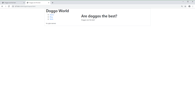
That's usually what you want. You can try it
What if you want the page to use the entire width of the window? Change container to container-fluid:
- <body>
- <div class="container-fluid border">
- <div class="row">
- ...
Then you get:
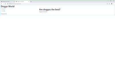
You can try it.
Exercise
Basic grid
Make a Bootstrap HTML page with a header, footer, and two sidebars. Here's the layout:
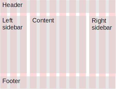
Both sidebars should have three grid columns each. Make the page about whatever you want: dogs, llamas, Vegemite, Borderland, whatevs. Put content in each region.
Submit the URL, as usual.
Up next
Grids are way cool, but they do more. They're central to making your site work on everything from a phone to a big desktop monitor. That's up next.
