What is a page layout?
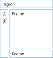
The layout is the overall structure of the content on the page. The main areas of the page are called regions.
Content region
At the center of the page is the content region.
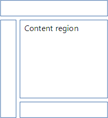
This is the core of the page. It's where you'll find the blog post, the product information, or whatever the main purpose of the page is.
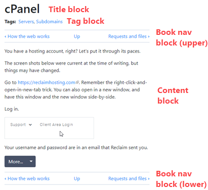
The content region is made up of blocks. A block is a rectangular area. On some sites, the content area has just two blocks: title, and content.
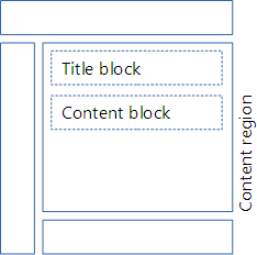
The site you're looking at now has several blocks in the content region:
Sidebar regions
On the left and right are the sidebar regions. Many sites just have one of the regions.
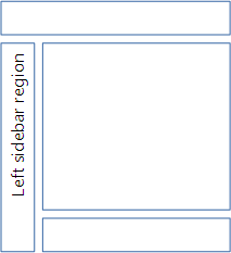
Sidebars can hold just about anything. Ads, newsletter signup forms, whatevs.
Sidebar contents are often the same (or very similar) from page to page. For example, the exercise list is always in one sidebar of this site. Well, when you're logged in, anyway. The other sidebar has a list of lessons, a suggestion button, and some other things.
Header region
At the top of the page is the header region.
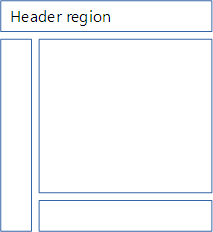
("Header" is an overloaded word in the web biz. That's geek talk for "has several different meanings.")
The header region on this site...

has...
- A branding block (logo and site name)
- A progress emoji (when logged in)
- A main menu block
The menu is also called a navbar, short for navigation bar. Any block with several links might be called a navbar.
Footer region
Last, there's the footer region at the bottom.
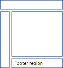
This site just has one block with some links.

However, it's common to have lots of stuff in the footer. This one...

... has a form, two menus, and social media links.
Components
Remember that we're using the website framework Bootstrap, to make things easier for us. Bootstrap gives you a bunch of different components you can add to blocks. Let's check out a few of them.
Jumbotron
Highlights key messages. Like this:
The thing that looks like a button, with "Learn more" on it? It's actually a regular a tag, with some classes. Here's the code:
- <a class="btn btn-primary btn-lg" href="javascript:alert('Clicky click')" role="button">Learn more</a>
The classes make it look like a button. More on that later.
The weird stuff in the href stops the link from actually going anywhere. That's just for this page; on a real site, you'd have a URL there.

Marcus
So we have to use those colors?
No, you don't. BS has a couple of built-in color options, but you can use themes, that have completely different color palettes. We'll talk about them later.
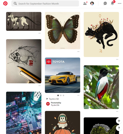
Card
A container for a small amount of content. Pintrest uses them, like this:
Here's a BS card. (The link doesn't go anywhere.)
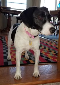
Cards are often stacked vertically or horizontally.
Carousel
A slide show thing.
If you change the width of your browser, the carousel will resize. Give it a try.
Modal
A dialog box with some content.
Cool!
You can use modals for Dad jokes.
Why does Norway paint bar codes on the sides of their navy ships?
Navbar
Short for navigation bar, navbars are used in headers, and other places. Here's a navbar, for the DoggoLand theme park. (The links don't do anything.)
This navbar has a dropdown menu, but that's optional.
Too hard from scratch
Making this stuff is too hard, if you try to code it all yourself. Let's not.
Bootstrap gives you HTML templates to make all of these components, and many more.
What's next?
In the next lesson, you'll learn a template for a basic Bootstrap page. Nothing fancy, just enough to get us started.

