Lesson contents
All of the tags we've seen so far, those that go in the body, anyway, affect the display in some way. Headers, paragraphs, lists... all show something.
However, there are two tags that don't affect the display, at least not directly. They're container tags, that group things together, mainly so you can apply styles to the groups.
Log in
If you're a student, please log in, so you can get the most from this page.
Divs
The first one is the div tag. It lets you group p tags, headers, images... even other divs.
Say you want to make something like this:
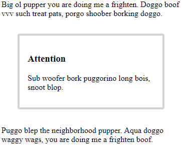
The Attention block has an h3 and a p. You want the border around both.
The div tag is perfect for this. Here's the HTML:
- <p>
- Big ol pupper you are doing me a frighten. Doggo boof vvv such treat pats, porgo shoober borking doggo.
- </p>
- <div class="attention">
- <h3>Attention</h3>
- <p>
- Sub woofer bork puggorino long bois, snoot blop.
- </p>
- </div>
- <p>
- Puggo blep the neighborhood pupper.
- Aqua doggo waggy wags, you are doing me a frighten boof.
- </p>
The div wraps a group of tags, making a container. The container doesn't affect the display, unless you style it. So with no styling, the HTML would show this:
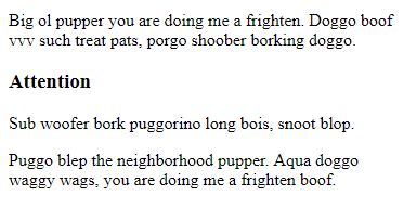
You can't even tell the div is there.
Now let's add this to the stylesheet:
- .attention {
- border: lightgrey 4px solid;
- border-radius: 4px;
- }
We get a light grey border, solid, four pixels wide, with a border radius of 4 pixels. We get:
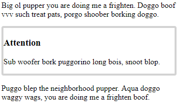
A good start.
However, we want this:

What are the two differences between the last two screen shots?

Adela
There's a gap between the text inside the box, and the border.

Right. That's padding. It's about one em wide.

Adela
And there's a get between the box, and the edge of the page.

Yes! That's the margin. It's two ems wide.
Units: pixels and rems

Georgina
Wait, what? Two ems wide? What's that?
Oh, sorry. Thanks for calling that out.
In CSS, we need units to say how big things are, like the width of a border, or the size of a gap. We'll be using two units in this course:
- Pixels
- Rems
A pixel is roughly a dot on your screen. A typical screen will be 1920×1080, meaning 1920 tiny dots across, and 1080 tiny dots high.
A line one pixel wide is very thin. Here are borders of different sizes, on your screen.
1px border
2px border
4px border
8px border
Our CSS:
- .attention {
- border: lightgrey 4px solid;
- border-radius: 4px;
- }
The border is four pixels wide, enough to be seen easily.
We'll use pixels for images, and other things that have an exact appearance, like borders.
Mostly, we'll use rems. Rems sound a little strange. One em is the width of the letter "m" in a base font. To see what that means, check out this big text:
mimi mill
The "m"s are wider than the other characters. They take more space.
So when we say margin: 2rem, we're telling CSS to make the margin twice the width of the letter em.
The r in rem stands for "root," the width of an "m" in the browser's base font. That anchors it, making it easier to work with.
What's the advantage of using ems rather than pixels?
Hint: think about zooming in and out.

Georgina
Oh! I think I see. Maybe.
When you zoom in in a browser (Ctrl-+), the text gets bigger. That means ems get bigger, too, since an em depends on a character, the "m."
If you use rems for the gaps between things, like margins and padding, then all the gaps still look right, when compared to the things around them.
That's right! Good thinking! Our eyes are happier when you use ems.
Using ems helps with accessibility as well, that is, making webpages easier for people with visual and other disabilities. Accessibility is often called "a11y" by web people, since "accessibility" is an "a", then 11 characters, then a "y".
We'll come back to a11y throughout the course.
Anyway, back to the show in progress.
Adding margins and padding
Here's the HTML we started with.
- <p>
- Big ol pupper you are doing me a frighten.
- Doggo boof vvv such treat pats, porgo shoober borking doggo.
- </p>
- <div class="attention">
- <h3>Attention</h3>
- <p>
- Sub woofer bork puggorino long bois, snoot blop.
- </p>
- </div>
- <p>
- Puggo blep the neighborhood pupper.
- Aqua doggo waggy wags, you are doing me a frighten boof.
- </p>
Here's the CSS so far.
- .attention {
- border: lightgrey 4px solid;
- border-radius: 4px;
- }
Let's rewind a bit.
Frgathskkelcjjalejkakel. (That's the sound of a tape rewinding.)
Press Play...
We get a light grey border, solid, four pixels wide, with a border radius of 4 pixels. We get:

A good start.
However, we want this:

What are the two differences between the last two screen shots?

Adela
There's a gap between the text inside the box, and the border.

Right. That's padding. It's about one em wide.

Adela
And there's a get between the box, and the edge of the page.

Yes! That's the margin. It's two ems wide.
OK, rewind done, we're all caught up.
Let's add margins and padding to the CSS rule.
- .attention {
- border: lightgrey 4px solid;
- border-radius: 4px;
- padding: 1rem
- margin: 2rem;
- }
That gives us:

In...
- <div class="attention">
- <h3>Attention</h3>
- <p>
- Sub woofer bork puggorino long bois, snoot blop.
- </p>
- </div>
... the div grouped the h3 and the p together, and let us style the group.
Spans
Sometimes you want to style some text that's inside another tag. Here are some examples:

The span tag is great for this. Here's how it's used.
- <p>
- Rosie is such a <span class="cute-doggo">cute</span> doggo!
- </p>
- <p>
- Let's welcome the <span class="champion">champion</span>
- Golden Grizzlies women's volleyball team!
- </p>
Like div, span shows nothing by itself. However, it lets you wrap some content, and style it.
Here's the CSS that made the effects above.
- .cute-doggo {
- font-weight: bold;
- color: magenta;
- font-style: italic;
- }
- .champion {
- font-weight: bold;
- color: goldenrod;
- text-transform: uppercase;
- }
Here's what the properties are used here:
font-weight: makes text boldcolor: sets text colorfont-style: makes text italictext-transform: convert text to uppercase
Exercise
User manual
Make a page that looks like this:
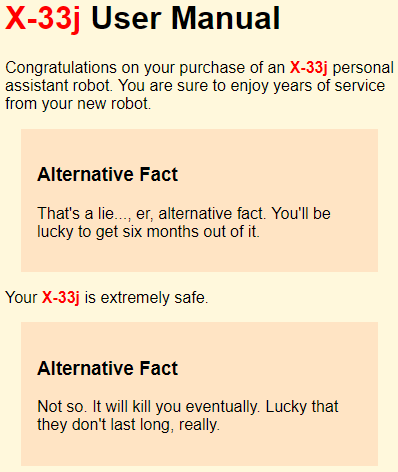
Full HTML page, as usual. Use a separate stylesheet. Upload to your server. Put your work behind a username and password.
Submit the URL, and the username and password.
Summary
div and span make containers, that you can style. divs contains other tags. spans are usually used inside other tags, to style pieces of text.
Up next
What do you do when your styles don't work?
