Lesson contents
What is accessibility?
Accessibility is about making websites that people with disabilities can use. For example, blind people use screen readers, software that reads out a webpage's contents. A webpage can help a screen reader do its work, or get in the way, depending on how the page is designed.
Blind people also have trouble using a mouse, so rely on their keyboards to navigate around pages. Some sites are easy to use with a keyboard. Some are not.
If you want, you can try a vision impairment simulator.
People with dyslexia can have trouble using websites. Dyslexia is not just one thing, but occurs in a range, from mild to severe. To see what it's like to be dyslexic, you can try a dyslexia simulator.
Some people are color blind. You can help by choosing the right colors for your site. If you like, try a color blindness simulator.
Some people can't hear well. You can give them captions for videos, and transcripts of audio recording.
BTW, geeks sometimes shorten "accessibility" to "a11y." Because "accessibility" starts with an "a", then has 11 letters, then a "y." If someone talks about "web alley," you know they're one of the cool kids.
Why a11y matters
Several reasons. First, there's legal compliance. The US and other countries have laws requiring some websites to be accessible. US universities have been sued for not complying with a11y law.
Second, what about customers with impairments? If your online store is a11ied (I just made that word up), and your competitor's is not, where will those people go? Hmm...
Third, things you do for a11y also help everyone else. For example, a11y guidelines call for high color contrast. That also helps when there's glare on your screen.
Another one: closed captions. Want to watch a video, and don't have your earbuds? Turn off the sound, and turn on the closed captions. Nobody will know you're watching this video of Emma Stone on The Graham Norton Show.
Finally, maybe it's just the right thing to do. If you work for a greedy, soulless corporation that's crushing your spirit, hey, you can still feel good by making its website a11able. (That's another new word.)
Standards
The main a11y standard is WCAG, the Web Content Accessibility Guidelines. They're from the W3C, the World Wide Web Consortium, the people in charge of global web standards. They're El Jeffe of the web.
In the US, the other important standard is section 508 of the Rehabilitation Act. Federal government agencies, and sometimes those who do business with them, need to comply with the act.
WCAG and 508 are part of the web professional's lingo. You might hear:
Let's go 508 on this website!
Or:
Hey, wanna see a WCAG triple A? Come on! You know you do!
Bootstrap is accessible, but...
The BS team have done a good job with a11y. BS 3 had issues, but BS 4 is an a11y wizard.
However, you need to understand something. This is from the official BS statements on a11y:
... provided that these [BS templates] have been implemented correctly, it should be perfectly possible to create websites and applications with Bootstrap that fulfill WCAG 2.0 (A/AA/AAA), Section 508 and similar accessibility standards and requirements.
OK, you see the thing. If you use BS 4 correctly, good a11y. Don't use BS well, good a11y will elude you. "Hey! There goes good a11y! Shoulda used Bootstrap better."
Making your content accessible
Later in the course, you'll learn how to make menus, cards, carousels, and other BS components we looked at earlier. If you use the standard HTML templates for these components, you gets lots of chewy a11y goodness. You'll learn how to make the components a11iable as we go.
There's more to life than BS components, though. There's the content as well, the stuff you want to tell people. The text and the images that are the reason for a page to exist.
Content a11y guidelines
Christina Moore of Oakland University made a video about content accessibility. It has some good advice. It's not just for the web, but applies to other tools as well, like Microsoft Word.
Remember, Christina is talking about content a11y. Not structural elements, like sidebars and menus, but the stuff in the content region. So, this video is useful both for geeks like us, and nongeeks who write content.
W3C tips
Here's a list of a11y things, gleaned from the W3C's Tips for Getting Started. Some of it you heard Christina talk about already, but seeing it from another angle can't hurt.
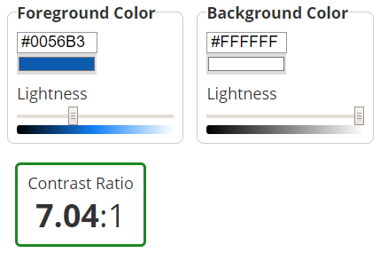
- High contrast colors. You should have at least a 4.5:1 contrast ratio between text (and buttons and things) and the background. There are color checkers that can help. For example, here's the ratio for the link text color and the background color, for this page:

- Don't use color alone to differentiate things. A red tick, and a green tick, look the same to people with red-green color blindness.
- Font sizes. Don't get too small. Like this.
- Alt property for images. Always give an
altvalue for images. Screen readers use them (and so might search engines). For example:<img src="rosie.jpg" alt="Cute small dog"> - Clear writing. Eschew obfuscation.
- Meaningful, unique page titles. Titles like "A dog!" aren't as good as "Rosie, a cute dog". Again, good titles also help with search engines.
- Use
h1-6tags to structure the page. Screen readers use them to help people jump around the page. - Meaningful link text. The code
Go <a href="https://cutepuppers.com">here</a>.isn't as good asSee <a href="https://cutepuppers.com">cute puppers</a>. - Design for different screen sizes. We got that one covered.
- Identify page language. That's in our HTML template.
From now on, all your exercise submissions must comply with this list.

Adela
There's one I'm not sure about: Use h1-6 tags to structure the page. Can you explain that one? Is that like what Christina was talking about for Word?
Yes, what Christina talked about for Word, we apply to the web.
hx tags should act like a table of contents (ToC) for a page. Only use hx tags for things you would want listed in the table of contents. For example, here is the ToC for this page:
Lesson contents
A program made the ToC automatically, by finding the hx tags on this page, and listing them. That program was downloaded with the page, and ran when the page opened in the browser.
Suppose I want to bring your attention to some text, by making it big and bold, like this:
Doggos! For the win!
I could make it by using an h1 tag, like so:
- <h1>Doggos! For the win!</h1>
That would show up in the ToC, but I don't want it to. It's not a header for a section of the page. I'm just using the h1 for the way it makes things look, not because it's an actual header.
Screen reading software relies on hx tags being meaningful. The software tells blind users about the structure of your page by looking for hx tags. It lets users jump to those places. If you use hx in a non-structural way - just for their display properties - you mess that up.
Many people, including myself, prefer to have just one h1 tag, for the page title. Then I start each section of the content with h2. Subsections use h3. I rarely use the other hxs, but h4 to h6 are there if needed.
The rule-of-thumb: only give hx tags to things you would put in a ToC.

Adela
OK, I get it, but how do you make that doggos-for-the-win thing, without messing up the ToC?
Here's the code I used:
- <p class="h1">Doggos! For the win!</p>
It's a p tag, so not listed in the ToC. The h1 class is part of BS. It makes an element look like an h1, without actually being an h1.
Like I said, Bootstrap 4 gives good a11y.
Testing accessibility
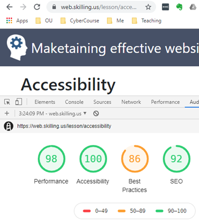
Browser dev tools (press F12, remember) have a11y checkers. For example, Chrome has an Audits tab:

It runs checks on a11y, performance, and other things. The last time I checked this page, here's what it said:

Can't get any better a11y than that!
You can run the checker on your own pages.
Exercise
The exercises you do for the rest of the course must take a11y into account. That's part of your performance criteria from now on.
To get started, here's a simple exercise, on assessing a11y.
Assessing a11y
The a11y lesson has an image like this, showing Chrome's assessment of a page's a11y at 100%:

The screen shot shows the page's URL at the top, and the audit scores below.
Make a screen shot like this for a webpage of your choice. Use Chrome, or another browser if you prefer.
Submit:
- The screen shot of the a11y score.
- A list of the your browser's suggestions for improving a11y. You can paste them into the submission text field, or add another screen shot.
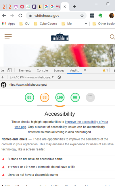
Chrome lists improvement suggestions below the audit scores. With Chrome, you can make a single screen shot that includes the page's URL, a11y score, and suggestions. For example:

Next up
Next, you'll learn how to use some of BS's fun components, starting with the Jumbotron.
