Here's an exercise, that uses most of what you have learned.
Exercise
Small business site
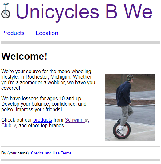
Make a website for a fictional small business. Whatever business you like. The example here is for a unicycle shop.
Here's a sample home page.

- Your site should have at least four pages.
- The branding area should have a logo and a header.
- Logo and header are clickable links to the home page. Notices to that effect show on mouse hover.

- The logo should be no taller than the site title.
- There should be a gap between the logo and the text.
- The site title should have no underline, even though it's a link.
- Have a navbar with a border at the bottom.
- Navbar links should be larger text than normal, and separated from each other. They should have hover notes.

- Have at least four photos. At least one of the them should float to the left or right.
- All images should have alt text.
- Put all images in an
imagesfolder. - Have links to at least two external websites. Make them open new tabs. Use small images to show that. Use this one, if you want:

- Include a table with at least three columns, and with column headings. In the Unicycle site, it would be on the product page.
- Have a footer with your name. Have top and bottom borders.
- The footer text should be smaller than the rest.
- Include a page with image and other credits, and site terms of use. Check the ToU on this site, if you need a hint.
- Use a stylesheet called
standard.css, for all or most of the styles. - All pages should have
html,head, and other tags that make a complete page.
Put your work behind a password, as usual. Submit the URL of your site.
If you were logged in as a student, you could submit a solution to this exercise.
That's the end of this module! You've learned a lot about making effective sites.
Next, you'll make a prototype of your final project. A prototype's a mockup you use for planning.
After that? Our sites have been, well, fairly ugly so far. We need to get the look right. We'll use Bootstrap, a website framework. Even geeks with no aesthetic sense can make Bootstrap sites that look OK.
Onward!
Book traversal links for Put it together
