Log in
If you're a student, please log in, so you can get the most from this page.
What's a prototype?
A prototype is a mockup of a site. It has some or all of the pages, but:
- Doesn't have the final look.
- Doesn't have the final content.
- The components don't work.
The components are things like slideshows, that you'll learn about in the next part of the course.
An example
Squee Moffat and Suzie Chen gave a list of ideas for the final project. They said they wanted to make a site for Pupperware, a small company that brings doggos to your event.
Next, they described the structure of the Pupperware site. They listed all of the pages they thought they would need.
Then they created a prototype of the site. Check it out. They made a page for each entry in their site structure.
Home page
The home page looks like this:

There's a menu at the top, with links to the other pages. The packages will be in a dropdown in the final site, but for now, they just listed the subpages in parentheses. You can look at the their source code, to see how they made it (Ctrl+U, remember).
Below the menu, there's a content region, and a footer region. They just have filler text.
Make a template
In fact, all of their pages have the menu, a content region, and a footer. So the first thing Squee and Suzie did was to make a template. Then they copied the template for every page. Saved them a lot of work.
Check out the pages
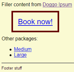
Click through all of the pages on the prototype site. They're mostly the same, with changes here and there, for each page's purpose. For example, on the package pages, you'll see:

This is a call to action, something people can do to go further. In this case, make a booking. Calls to action are often highlighted in some way, like this one is.

Ray
How did they make that?
Here's the HTML for it:
- <p class="call-to-action-container" >
- <a class="call-to-action" href="booking.html">Book now!</a>
- </p>
The link has the class call-to-action. Makes sense. It's wrapped in (is inside of) a p. The p has the class call-to-action-container, since it contains a call-to-action.
The reason Squee and Suzie added the call-to-action-container class was because of how they wanted everything to look. Here's the CSS:
- .call-to-action-container {
- margin: 2rem;
- }
- .call-to-action {
- font-size: 150%;
- border: solid thick #660000;
- padding: 1rem;
- }
The a with the call-to-action class has a font-size, border, and padding set. But to get whitespace around the whole thing, they needed to apply the margin to the container, not to the call-to-action itself.
You can use the same idea in your own prototypes. Later, you'll learn have a make an a look like a cool button.
Are prototypes real?

Adela
I get that we're doing this for our final project. But do people make prototypes for real?
Yes! People who make any kind of information system (IS) - website, accounting system, game - make prototypes. There are various reasons. For example, there are tech reasons. If you're making a game that will have a lot of artwork, you'll test the game engine with sample artwork first, before you have the artists spend hundreds of hours making assets.
However, the main reason you make prototypes for business projects, like business websites, has to do with failure. Project fail all the time. But why?
What do you think is the most common reason that IS projects fail?

Georgina
Hey, I went to an AIS meeting a couple of months ago. That's a student org, the Association of Information Systems.
There was a speaker from a big consulting firm. She said that people often don't know what they want, until they see it. Or what they don't want.
That's right! It makes sense. You ask someone what they want from a site, and they have to imagine something that doesn't exist. If you try to create it from their description, the chances of getting it right are low.
Even if you create exactly what they're imagining, the site might not do what they want. Maybe they predicted customers would like it, but customers don't like it at all.
What to do? Spend a little time creating a cheap prototype, like the one Squee and Suzie made. Then show it to the people you're making the site for.
It's a good investment. Find out what they don't like now, rather then waiting until you've spent a bazillion hours.
Exercise
Final project prototype
Make a prototype of your final project. Use the page list you created earlier as a guide, though you can change your mind about the pages.
Add at least three regions to each page:
- Site name and menu
- Content region
- Footer
Include a few images, as well as text.
You don't have to use real content. Filler content is fine.
Put your name(s) in the footer, like Squee and Suzie did.
Make sure all of the links work, and pictures show, of course. Test your work, before you submit it.
You can use the Pupperware prototype as a model, if you like.
Submit your URL, as usual. If you're working with someone else, you should both submit it.
Up next
The pages you've made so far don't look that great. Time to learn how to make professional. But be smart about it, by leveraging high-quality website frameworks that other people have made.
