Slide shows
Bootstrap calls them carousels. Here's one:
The arrows at the left and right are the controls.
This is scaled down. You can try the full-sized one.
The code
The template looks messy, but, fortunately, you don't changewith much of it.
- <div id="backgroundsCarousel" class="carousel slide" data-ride="carousel">
- <!-- Slides -->
- <div class="carousel-inner">
- <div class="carousel-item active">
- <img src="images/cactus1.jpg" class="d-block w-100" alt="Cactus">
- </div>
- <div class="carousel-item">
- <img src="images/oil.jpg" class="d-block w-100" alt="Oil">
- </div>
- <div class="carousel-item">
- <img src="images/water.jpg" class="d-block w-100" alt="Water">
- </div>
- </div>
- <!-- Controls -->
- <a class="carousel-control-prev" href="#backgroundsCarousel" role="button" data-slide="prev">
- <span class="carousel-control-prev-icon" aria-hidden="true"></span>
- <span class="sr-only">Previous</span>
- </a>
- <a class="carousel-control-next" href="#backgroundsCarousel" role="button" data-slide="next">
- <span class="carousel-control-next-icon" aria-hidden="true"></span>
- <span class="sr-only">Next</span>
- </a>
- </div>
Let's break it down. The whole thing is wrapped in a div:
- <div id="backgroundsCarousel" class="carousel slide" data-ride="carousel">
The only thing you have to mess with is the id. It can be anything, as long as:
- It's unique on the page.
- It matches the
ids in the controls. More in a moment.
Inside the main div are two parts:
- Slides
- Controls
- <div id="backgroundsCarousel" class="carousel slide" data-ride="carousel">
- <!-- Slides -->
- <div class="carousel-inner">
- Slides go here.
- </div>
- <!-- Controls -->
- <a ...>
- For the previous-slide button.
- </a>
- <a ...>
- For the next-slide button.
- </a>
- </div>
Slides
Here's the code for the slides area:
- <div class="carousel-inner">
- <div class="carousel-item active">
- <img src="..." class="d-block w-100" alt="...">
- </div>
- Repeat the last three lines for each slide.
- </div>
Set the img and alt attributes for each slide. For example:
- <div class="carousel-item active">
- <img src="rosie.jpg" class="d-block w-100" alt="Rosie">
- </div>
Add as many slides as you want.
Controls
Recall that we have a slides section, and a controls section:
- <div id="backgroundsCarousel" class="carousel slide" data-ride="carousel">
- <!-- Slides -->
- ...
- <!-- Controls -->
- ...
- </div>
Here's the code for the controls:
- <a class="carousel-control-prev" href="#backgroundsCarousel" role="button" data-slide="prev">
- <span class="carousel-control-prev-icon" aria-hidden="true"></span>
- <span class="sr-only">Previous</span>
- </a>
- <a class="carousel-control-next" href="#backgroundsCarousel" role="button" data-slide="next">
- <span class="carousel-control-next-icon" aria-hidden="true"></span>
- <span class="sr-only">Next</span>
- </a>
You have to match the id you used earlier.
- <div id="backgroundsCarousel" ...>
- ...
- <a ... href="#backgroundsCarousel" ...>
- ...
- </a>
- <a ... href="#backgroundsCarousel" ...>
- ...
- </a>
- </div>
Notice that #. That has to be there.
Summary
To make a carousel:
- Copy the template code.
- Make a
divfor each slide. - Make an
idfor the outerdiv, and use it in each of the controls.
Preparing images
It's best to make all of the images the same size. The images in the example are all 1,024px x 683px. I got them from Unsplash, and sized their width down to 1,024px.
When you resize images, just do one dimension at a time. Let you image editor compute the other dimension for you. Otherwise, the images get distorted.
Suppose you have two images, one is 200px x 200px, and the other is 220px x 200px. The second is a little wider. In that case, you don't want to resize the image, you want to trim its canvas.
What's the difference? Here's a photo of an angry cat.

It's 230px x 296px. I want it square, 230px x 230px.
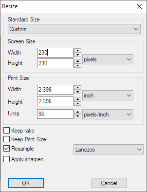
Suppose I resize it to 230px x 230px. Here's the XnView dialog:

I put 230 in both width and height. Here's what I get:

Distorted. It looks even angrier.
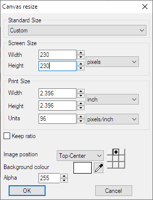
OK, I'll trim the canvas instead.

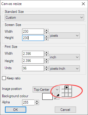
Height and width are 230. Notice the image position.

This means to start at the top of the image, go down 230px, and chop off everything below that. This is that I get.

The cat's still angry, but the photo is 230px x 230px, without being distorted.
It takes a bit of practice to edit images well. Mess around.
Limit carousel width
Normally, carousels take the entire width of the page, but you can change that. Suppose we wanted this (zoomed out):

The carousel is 10 grid columns wide (out of 12, remember). It's centered, so there's a gap at the left and right. There's gaps above and below the carousel, as well.
There are various ways to do this. Let's look at a simple one. First, wrap the carousel in a div.
- <div> New wrapping div
- <div id="carouselExampleControls"... Carousel code from before
- ...
- </div>
- </div>
Now, let's add some classes to the wrapping div.
- <div class="col-sm-10 mx-auto mt-4 mb-4">
col-sm-10 ways to make the div 10 grid columns wide. Since there should be 12, there are two left. mx-auto says to center the div, so there'll be blank space to the left and right. mt-4 says to make a margin at the top. mb-4 says to add a margin at the bottom. Why 4? Just play with the number until you get what you want.
Exercise
Carousel
Make a page with a slide show, like the one in the carousels lesson. Have at least three slides. Use the same controls that are in the lesson, that is, the arrows that change the slides.
The images can be anything you want, but must not be distorted.
Submit your URL as usual.
Up next
Most sites have forms, that let people enter data. Contact forms, shopping forms, search forms... many different types. The next lesson is about how to make forms.


